Pictograms: universal by design, local by nature

Pictograms are everywhere – on our phones, in our cars, guiding us through airports and cities. I recently attended the curator's talk for Pictograms: Iconic Japanese Designs, currently on view at Japan House LA.
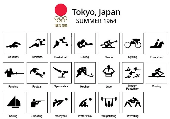
The exhibition traces how Japan shaped this universal visual language through a design tradition built on precision, clarity, and refinement. Exhibition curator Daigo Daikoku, CEO and Art Director of Nippon Design Center (NDC) USA, presented NDC's pictograms for the 1964 Tokyo Olympics. For the first Olympics ever held in Asia, NDC was entrusted with establishing a universal visual language that could guide visitors from around the world.
The little icon that contains a whole culture
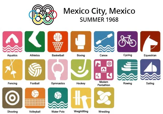
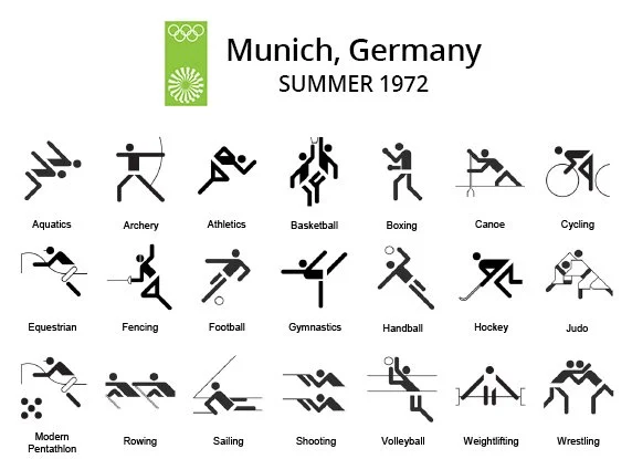
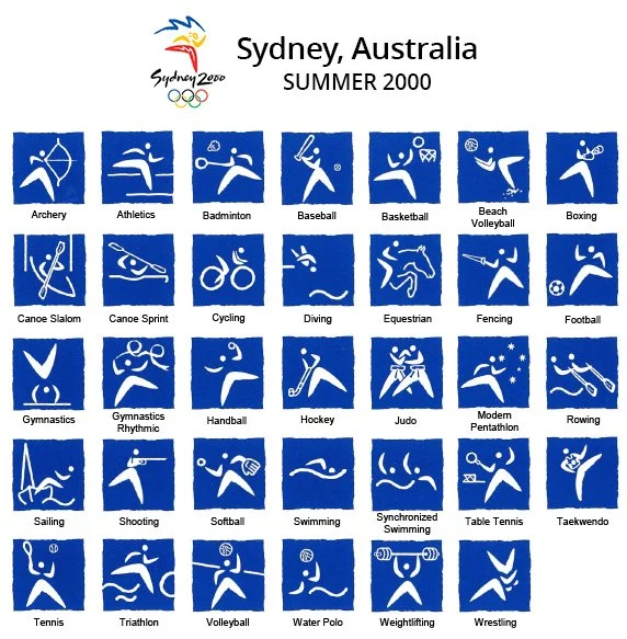
What struck me most, though, wasn't the universality, but how local each set of Olympic pictograms actually is. For subsequent Olympics, each host country set out to design its own pictograms - and the results are fascinating. The designs encapsulate the essence of each culture in every stripped-back symbol. It reminded me a lot of the work we do in global communications: taking the core message of the original, and packaging it in a way that resonates best in another market. These pictogram feel like transcreation in its most distilled form.
Design through culture
Tokyo, 1964 — Clean, reduced silhouettes rooted in the Japanese principle of finding the essential gesture of a thing and stopping there. Universal by design, but shaped by a culture that treats reduction as its highest aesthetic virtue.
Mexico City, 1968 — The first Games to let local culture speak openly. Pre-Hispanic glyphs provided the structural logic; Huichol art inspired the parallel lines used for water. The symbols told you exactly where you were.
Munich, 1972 — Otl Aicher's geometric grid was so rigorously universal that several later hosts simply reused it — proof that a system built to transcend place can become its own kind of cultural statement.
Sydney, 2000 — Boomerangs formed the structural element inside every athlete silhouette, embedding Aboriginal material culture directly into the body of each icon. Local heritage wasn't decorative. It was load-bearing.
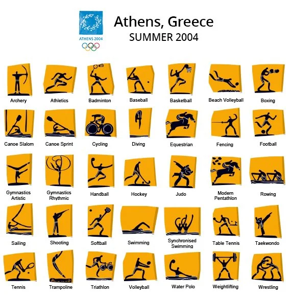
Athens, 2004 — Inspired by Cycladic figurines of Ancient Greece, the culture is encapsulated in not only the silhouette of the athletes, but also the irregular shapes of the pictogram frames which represent fragments of ancient vases.
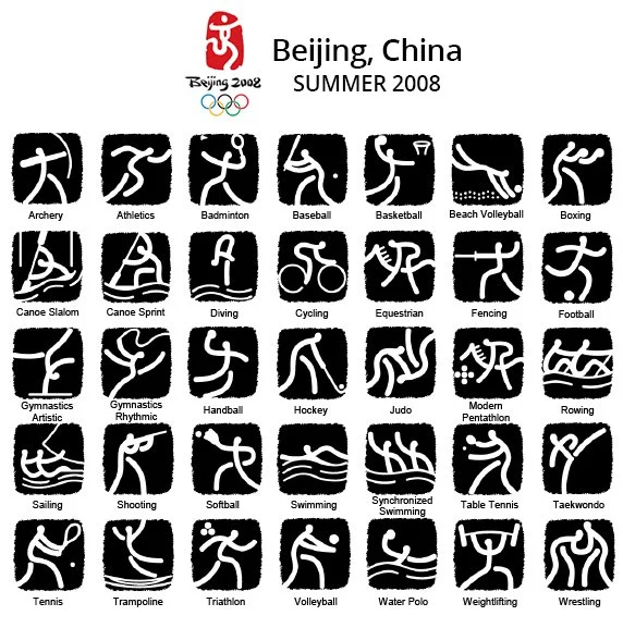
Beijing, 2008 — Ancient Chinese pottery script became the design source, lending a calligraphic quality to every silhouette. The pictograms worked as wayfinding and as a quiet argument that Chinese visual tradition is thoroughly contemporary.
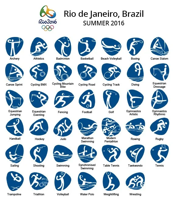
Rio, 2016 — Silhouettes were built from the Games' own typeface, itself shaped by Rio's coastline. City, typography, and athlete collapsed into a single continuous form.
It was so interesting to hear that pictograms emerged from a very specific Japanese design tradition: an obsession with clarity and reducing something to its essential form. But comparing the subsequent Olympic pictogram systems, it’s clear that what emerged wasn't a universal language, but a cultural representation that can be understood by all.
Pictograms: Iconic Japanese Designs is free and open at Japan House LA, 6801 Hollywood Blvd, through May 3, 2026. Images: mediamadegreat.com